

In today’s data driven and information era, data is no longer a problem to gather. Data is infact present everywhere, there exist unlimited sources to gather information and perform an accurate and strategic analysis and further reach conclusion based on the same. The core element is to examine through the vast volumes of data avaliable and accurately intrepret its implications. However, inorder to sort out through all the data and reach valid conclusions, one needs the right/accurate statistical data analysis tools/methods. `
Currently with the easy availability of big data, experts in the profession/analylists have come up with advanced and vailable techniques for data interpretation.
Statistics in the world of finance plays an integral role, it is a crucial process behind how one makes decisions based on data and make future standard estimates. Statistical analysis allows researchers to interpret a specific area of study and accurately deals with things.
Correlation Analysis:
Correlation Analysis is one of the methods of conducting an accurate data driven statistical analysis inorder to draw a final conclusion/answer. Correlation Analysis is a foundational statistical method used in data-driven decision-making to measure the strength and direction of relationships between two or more variables.
Correlation is a statistic that measures the degree to which two variables move in relation to each other. It depicts the strength of a relationship between two variables and is expressed numerically by the correlation coefficient. The correlation coefficient’s values range between -1.0 and 1.0.
A perfect positive correlation means that the correlation coefficient is exactly 1. A perfect negative correlation means that the two variable move in opposite directions, while a zero correlation implies no linear relationship.
A correlation coefficient quite close to 0, but either positive or negative, indicates little or no relationship between the two variables. A correlation coefficient close to plus 1 means a positive relationship between the two variables, with increase in one variable of the variables being associated with increase in the other variable. There exists a direct realtionship between the two variables.
A correlation coefficient quite close to -1 implies a negative or inverse relationship between the two variables, with an increase in one of the variables being associated with a decrease in the other variable.

Statistical Formula:
The primary formula for Pearson’s correlation coefficient (r), measuring linear relationship strength, involves sums of products and squares:
𝑟=𝑛(∑𝑥𝑦)−(∑𝑥)(∑𝑦)[𝑛∑𝑥2−(∑𝑥)2][𝑛∑𝑦2−(∑𝑦)2]√,
where n is data points,
𝑥𝑦 is sum of products of each (x,y) pair,
𝑥,𝑦 are sums of x’s and y’s, and
𝑥2,𝑦2 are sums of squared x’s and y’s; it normalizes covariance to a -1 to +1 range, with 1 being perfect positive, -1 perfect negative, and 0 no linear correlation.
Pearson Correlation Coefficient Formula:
- Formula:
𝑟=𝑛(∑𝑥𝑦)−(∑𝑥)(∑𝑦)[𝑛∑𝑥2−(∑𝑥)2][𝑛∑𝑦2−(∑𝑦)2]√ - Where:
- 𝑛 = number of data points
- 𝑥𝑦 = sum of the product of each x and y value (e.g., 𝑥1𝑦1+𝑥2𝑦2+…)
- 𝑥 = sum of all x-values
- 𝑦 = sum of all y-values
- 𝑥2 = sum of all squared x-values (e.g., 𝑥21+𝑥22+…)
- 𝑦2 = sum of all squared y-values (e.g., 𝑦21+𝑦22+…)
Alternative (Covariance-based) Formula:
Correlation (𝑟) can also be found by dividing the covariance of X and Y by the product of their standard deviations.
- 𝑟=Cov(𝑋,𝑌)𝑠𝑥𝑠𝑦
Key Interpretations:
- -1 to +1: The result is always between -1 and +1, indicating strength and direction.
- +1: Perfect positive correlation (variables move perfectly together).
- -1: Perfect negative correlation (variables move perfectly opposite).
- 0: No linear correlation.
Major Characteristics:
Objective: To understand, quantify, and analyze the degree of relationship/association/connection between two variables (e.g.,Do they move together or in opposite directions?).
Types of Correlation:
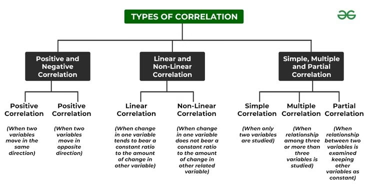
- Positive Correlation: Both variables move in the same direction/direct relationship. An increase in one variable is realted to an increase in the other and a decrease in one is related to decrease in the other.(e.g., higher advertising budget leads to higher sales).
- Negative Correlation: Variables move in opposite directions/inverse or negative relationship. When one variable increases or decreases the other variable moves in the reverse direction. (e.g., price increase causes lower demand).
- No Correlation (Zero): Changes in one variable do not affect the other/ no linear relationship at all.
- Simple Correlation: The relationship under simple correlation is restricted to two variables.
- Multiple Correlation: In case of multiple correlation the relationship exists between more than two variables.
- Partial Correlation and Total Correlation: Where more than two variables are taken into account but the relationship of two or more variables is examined, assuming other variables as constant. (e.g., coefficient of correlation between yield of crop and chemical fertilizers assuming a constant temperature is known as partial correlation and the total correlation is based on all the relevant variables.
- Linear And Non-linear Correlation: It is based on the ratio of change. If the ratio of change of two variables X and Y remains constant throughout, then they are said to be linearly correlated. The visual representation (graph) of variables of linear correlation will form a straight line. Whereas, When the ratio of change between the two variables is not constant but changing/fluctuating, correlation is said to be non-linear or curve-linear.
- Correlation Coefficient (rr𝑟): A numerical valuation, typically ranging from -1 to +1, that quantifies the relationship.
- rr𝑟 close to 1 or -1: Strong relationship.
- rr𝑟 close to 0: Weak or no linear relationship.
- Key Methods From Experts/Analysts:
- Pearson Correlation Coefficient (rr𝑟): Measures linear relationships between continuous variables.
- Spearman’s Rank Correlation (ρrho𝜌): Measures monotonic relationships (often used for non-linear or ordinal data).
- Kendall’s Tau (τtau𝜏): Used for small datasets with tied ranks.
Execution And Advantages:
- Predictive Modeling & Machine Learning: Used for feature selection to identify relevant variables and remove redundant ones, improving model efficiency.
- Business: Analyzes customer behavior, such as linking satisfaction scores to repeat purchases.
- Risk Management: Helps in portfolio diversification by identifying how different assets move in relation to each other. Quite used in Finance to analyse the data and make its optimim use.
- Scientific Research: Identifies potential risk factors in healthcare.
Limitations:
- Correlation ≠is not equal to≠ Causation: A strong correlation does not mean one variable causes the other to change; they may both be influenced by a third variable.
- Linearity Constraint (Pearson): Only detects linear relationships and may miss complex, non-linear dependencies.
- Sensitivity to Outliers: Extreme data points can significantly distort results and lead to inaccurate decisions.
Graphic Methods of Determination of Correlation:
Scatter Diagram:
This visual method of representation of the statistical data is a simple and accurate method of diagrammatic representation of a bivariate distribution for ascertaining the nature of correlation between the two variables. Pairs of the respective variables (X₁, Y₁), (X₂, Y₂), …, (Xₙ, Yₙ) or simply X and Y are tracked as dots on the X axis and Y axis. It is conventional to plot the independent variable on the horizontal or the X axis and the dependent variable on the vertical or the Y axis.
A bivariate distribution describes the joint probabilities and relationship between two random variables, showing how their outcomes occur together, unlike a normal (univariate) distribution which only looks at one variable.

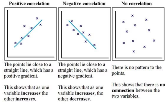
The primary graphic method for correlation is the Scatter Diagram (or Dot Diagram), where pairs of data (X, Y) are plotted as dots on a graph to visually assess the relationship’s direction (positive/negative) and strength (high/low/none) by observing the pattern of the dots, indicating if they cluster around an upward, downward, or random trend. Another method involves plotting time series data as two separate curves on the same graph to see if they move together.
If the diagrammatic representation/graph on the scattered diagram depicts an upward or a downward trend the variables are understood to be in correlation, on the other hand, if they do not show any trend and are scattered the two variables have no correlation.
Scatter Diagram Method (Dot Diagram):
- Plot Data: Plot one variable (X) on the horizontal axis (X-axis) and the other (Y) on the vertical axis (Y-axis).
- Mark Points: For each pair of (X, Y) values, place a dot on the graph.
- Interpret/Analyse Pattern:
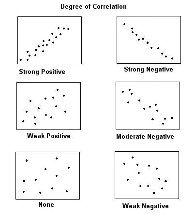
- Perfect Positive: Points form a straight line from bottom-left to top-right (r = +1).
- Perfect Negative: Points form a straight line from top-left to bottom-right (r = -1).
- High Positive: Points cluster in a narrow band, rising upward.
- High Negative: Points cluster in a narrow band, falling downward.
- No Correlation: Points are scattered randomly across the entire graph